
#GivingTuesday is coming up at the end of the month, and with it your chance to gain valuable donations for your organization!
AlumniFinder has developed a #GivingTuesday Toolkit to help you make the most of this giving movement. While there are strategies you can use to create a successful social campaign included in the toolkit, it’s equally important to pay attention to the design of your #GivingTuesday donation page.
Here are good examples to consider when making your donation page:
St. Jude Children’s Research Hospital
St. Jude’s #GivingTuesday donation page is incredibly well done. There are two key things they do that can be implemented by other organizations: giving options for donations and including a simple, clear call-to-action to donate.
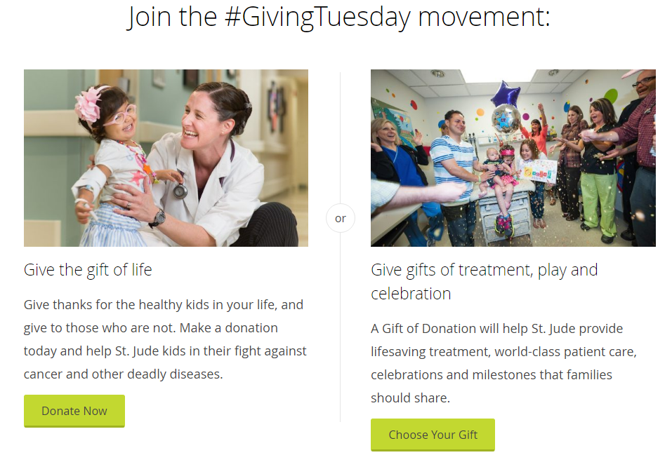
When you visit, you can either “donate now” and give general support for St. Jude’s or you can “choose your gift.” The second option allows you to donate concrete items, like a radiology treatment or a child’s birthday party. Many donors like to know where their money is going, so offering this kind of clarity is a great tactic.

Researching donation pages, I have to say this is one of the most effective call-outs I found. Anyone can get on board with “help more kids live.” This is the kind of statement that has the emotional impact of a punch to the gut. An emotional call-to-action is priceless when it comes to getting more responses, plus this is simple and clearly stated. If you want donations, do this.
Nothing But Nets
This donation page set-up is also noteworthy in two ways: a clear, immediate breakdown of how many nets are available for each suggested donation amount and a headline advertising matching gifts for #GivingTuesday.
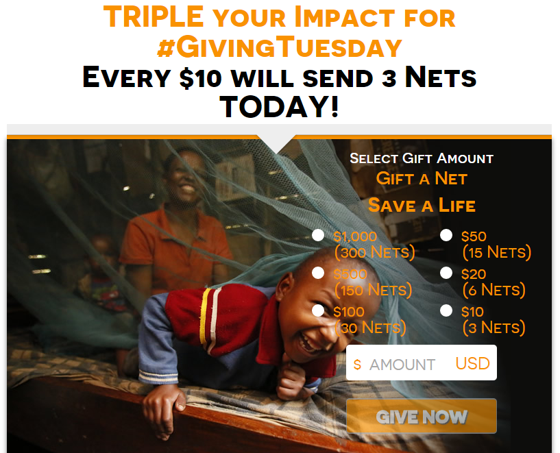
It’s a great idea to set-up a matching gift for your #GivingTuesday donations, if you can arrange it. This highlights a sense of urgency to give on the day to make your dollar stretch further. This is also a great set-up for showing how that translates into the amount nets (or whatever is most relevant to your organization) you are giving if you donate on #GivingTuesday.
When it comes to nonprofit-storytelling, this is hands down the best page I found. While it’s important to say that 240,000 children were newly-infected with AIDS in 2013, people simply do not respond to such large numbers. That’s where story-telling for nonprofits becomes critical. Show your donors who they are helping.
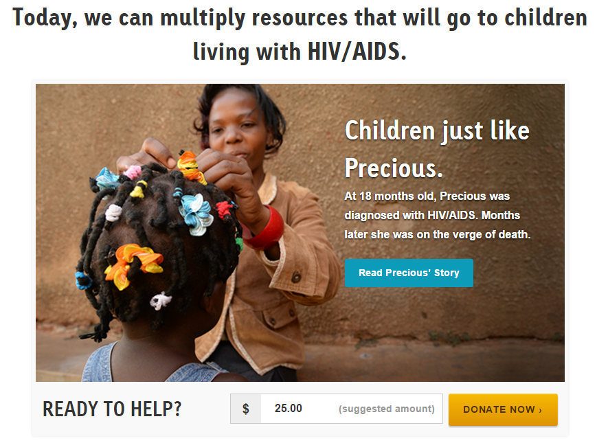
It’s important to note that they didn’t give the full story. You don’t want to overload your visitors with content, but you do want to identify a person you are helping. In this case, we went on a journey from giving resources to “children” to helping a little girl named Precious who almost died, if not for this great organization.
Related: Download the #GivingTuesday Toolkit Now!
WaterAid
When telling your organization’s story, don’t forget video. One way to capture what makes your cause or organization so important is to share it with video. The 2015 WaterAid #GivingTuesday donation page is a great example of how to make a video your focus.
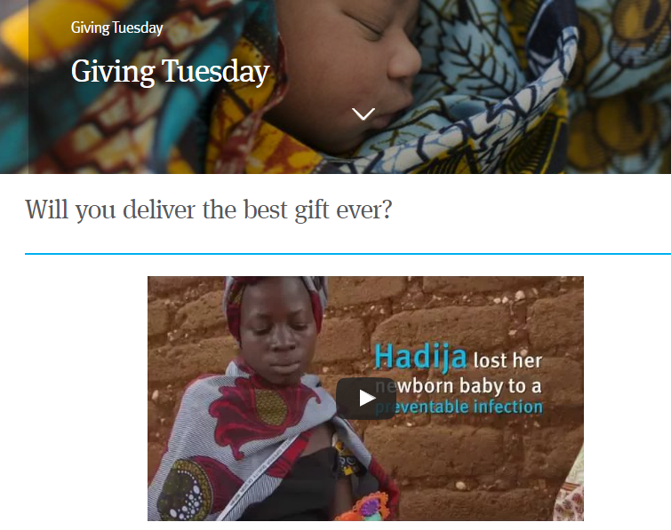
Once again, telling a story with a person as your focus is a great strategy. Right away, we know that we’re helping Hadija and women like her. One thing that I found missing on this page is an emphasis to donate. Remember, your CTA needs to be clear and immediate. Most people aren’t going to want to search around to give you a donation. It is worth noting that if you take a look at the link above, they’ve done a fantastic job making the donation emphasis for this year. The floating donate button that glides down the page as you scroll is a huge improvement!
CARE
Similar to offering different donation options, if you sell merchandise that supports your organization #GivingTuesday can be a good day to let folks know. A donation is a donation, so while it can be considered a distraction from your main call-to-action, if you feel it is valuable you can also tell people about your online store.
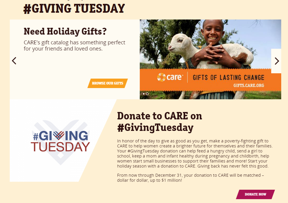
Don’t forget to emphasize #GivingTuesday on your landing page, though, or you might lose visitors who expect to see it prominently.
So, what are you doing to ensure success for this #GivingTuesday?
